” Which design principles did you use to create your infographic in Canva?” Which elements of a “good infographic” were you able to incorporate? What other principles did you consider? “
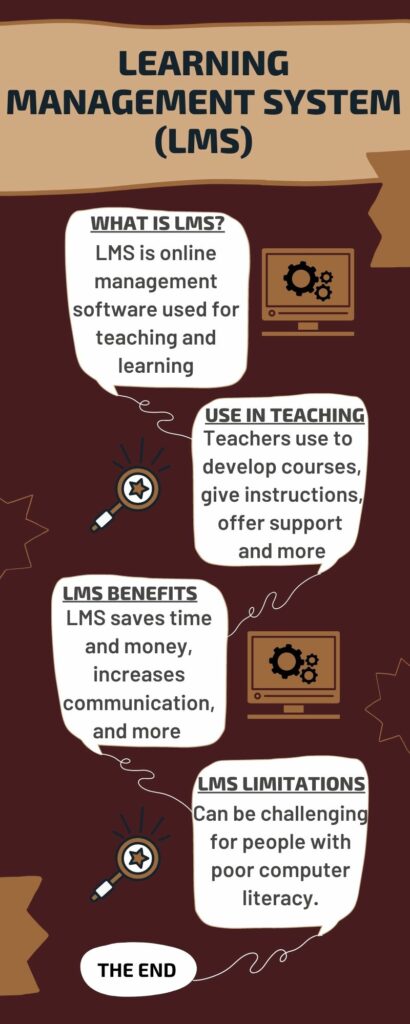
I have decided to create an infographic about learning management systems (LMS) while following the design and Mayer’s principles.
Focusing on alignment was the first design principle I applied. I made every effort to ensure that the components of my design were connected to one another and correctly aligned. Second, I tried to direct the viewer’s eyes to the key components of the design by utilizing the contrast of the colours I was employing. For instance, in the design’s informational component, I utilized a white background and a black font. Third, I made good use of repetition. For instance, in order to unify the design and overall aesthetic, I frequently utilized the same colours, fonts, or shapes. Fourth, I made the colours as supportive of the design as possible. I reviewed the basics of colour theory and chose to use the “brown colour schemes,” which symbolize safety, security, and support.
Some of the elements of a ‘good infographic’ that I incorporated in my design are the following; I kept the colour scheme simple, sticking to two to three colours, keeping the same design style throughout, trying to leave as much white space as I could, and thinking about utilizing the fewest necessary fonts.
The other principles I took into account were Mayer’s Coherence Principle (by avoiding extraneous, distracting material), the Signaling Principle (by using contrasting colours to draw attention to the information), and the Spatial Contiguity Principle (by ensuring that relevant text and visuals are situated close to one another).
Hi, I enjoyed reading your blog. Is LMS exist? Is it the application you invented? I like the way you use the contrast of colors and plain language. It is easy to understand the concept and follow the steps. I can see how you put effort to follow the inclusive design. But I was wondering about the supportive color that you mention it. Is there any color that is inappropriate and does not give safety, security, and support impressions?
Hi Akira,
I am glad you enjoyed reading the blog. LMS is just Learning Management systems that education schools use. For instance, UVic use brightspace to deliver lessons and communication with students, so Brightspace is a learning Management Software. What I meant is that colours symbolize different meanings, so it is important to figure out their meanings and use in their appropriate place.
Hi Abdul,
I really enjoyed how you explained your infographic by walking the audience through the design principles you described. Additionally, I also like how you incorporated other principles to compliment the aforementioned principles. Out of all the three principles you mentioned, which one do you believe has the most impact in terms of the learning process? What should also be factored in with design principles is the usability factor. Do you think that your infographic meets usability conditions, or are there things you would modify to compliment full usability.?